Back in the (Dragoon) Saddle!
After a hiatus of some eight months – the Duke is back!
His Grace has asked me to pass on his apologises for his enforced absence while he has been “distracted by sensitive affairs of State” (usually his code for keeping a low profile due to tax reasons). For my own part, too much of the last twelve months or so have been blighted by the slings and arrows of ‘real life’ and by the end of last year my miniatures painting had ground to a complete halt. I have barely picked up a brush since then, but in recent times a degree of normality has returned (including new employment) and I have started to paint again. So it’s time to re-boot the Blog.
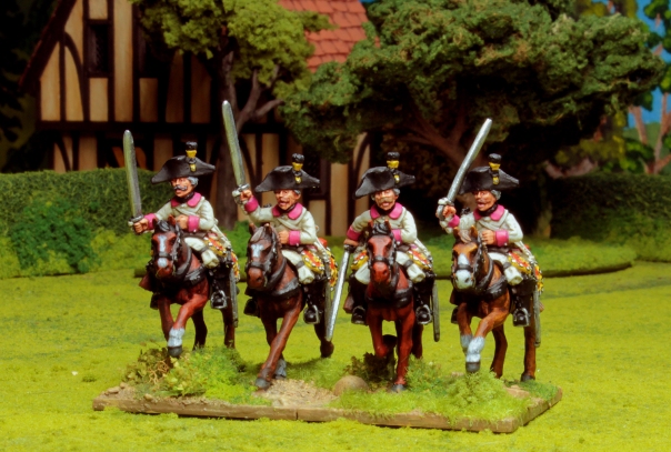
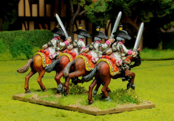
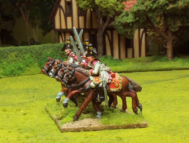
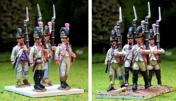
I’m breaking myself back in gradually (and you – gentle reader!) with a few small steps. Here is the first of them – a test run on four of Eureka Miniatures’ Austrian Dragoons for the Wars of the French Revolution, in advance of what will eventually be a larger unit of perhaps 12 or 16 figures.
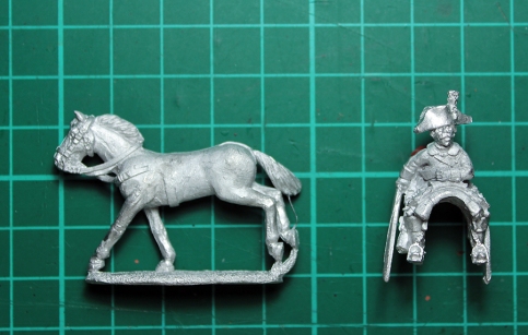
It has been a long time since I last painted any 28mm cavalry figures and I had forgotten how fiddly they can be. Each figure comprises two separate pieces: horse and rider – with the saddle and most of the horse furniture incorporated into the rider half of the miniature. The techniques employed to paint the rider (my usual approach of white undercoat and acrylic paint) and the horse flesh (an oil paint ‘wash and wipe’ method) are very different and the latter is rather messy, which encourages painting the two halves of the figure separately before gluing everything together near the end.
The dilemma here is that while the horse can be simply attached by its base to a temporary handle for ease of painting, the rider (with no standing base of its own) is difficult to attach to anything. Holding the figure in your fingers while attempting to paint can make life difficult. Some figure painters use narrow, domed topped pegs as painting handles that are custom made to be temporarily glued snugly into the u-shaped ‘tunnel’ under the rider’s saddle cloth, but I have yet to develop a system I’m comfortable with.
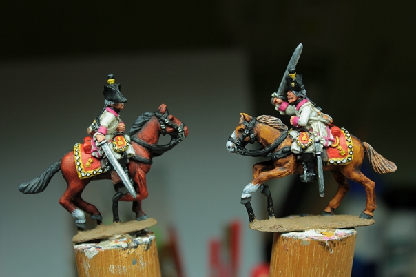
Well, for now, I just decided to plunge in and get on with it! The horses were mounted on my usual painting pegs – no problems there (and more on the horse painting technique a little later), but for the riders I resolved to paint just the lower half of the figure and their horse furniture (saddle cloth etc) while carefully grasping the casting by the head. The intention was then to attach the half painted rider to the (by then) completed horse and then paint the rest of him (head, shoulders etc) in situ on his mount. For the most part this worked out OK, aside from some major issues with finger cramp! My principal concern was how much finger grease I was getting on to the top half of the rider figures while I was clutching them in my hot, sweaty paws. Acrylic paint does not like grease of any kind, and I don’t like wearing plastic/rubber gloves. So once I had the half painted riders mounted on their finished horses I took some time to carefully clean up the parts of the figure I’d been holding using a cotton bud dipped in isopropyl alcohol before undercoating with my usual thinned white enamel paint. Incidentally, the thinned enamel undercoat can spray around a bit if you are too enthusiastic with the brush, so I cut out some little newspaper ‘aprons’ to wrap-around and cover the painted horse and the rider’s lower extremities to shield them from any accidental splashes.
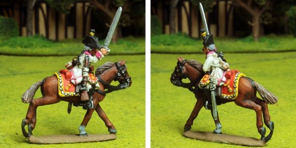
But enough of the tiresome logistics! What am I painting here? These are Austrian Dragoons roughly for the period 1792 – 1799, but principally they are meant to represent the 37th Cavalry Regiment, Coburg Dragoons, at the Battle of Neerwinden in 1793. Anyone who has ever dipped into the subject of Austrian cavalry during the Revolutionary and early Napoleonic Wars will know it is a near impenetrable mire of revised organisations, shifting regimental identities and changing uniform details – worthy of a entire Blog post in its own right to try and make sense of it all. For example, those readers more familiar with the sequential regimental numbering system of the later periods should note that prior to 1798 the Austrian army numbered its regiments without recourse to the type of cavalry regiment. Hence the army’s six Dragoon regiments in 1793 were not numbered 1 to 6 (as they were later), but 3, 9, 26, 37, 38 and 39! The 37th Cavalry Regiment would briefly become the 6th Light Dragoon Regiment in 1798, and then the 6th Dragoon Regiment in 1801. Other units had even more chequered progressions: the 9th Cavalry Regiment (Dragoons) was renumbered the 15th Light Dragoons in 1798 before changing to the 5th Dragoons in 1801. Confused? We are just scratching the surface here folks! It is sometimes easier to keep track of regiments by the names of their Inhaber (colonel-proprietor) and in the case of the 37th (6th) they remain the Coburg Dragoons throughout the period, but other regimental names switched with a change of Inhaber to add to the confusion.
It is also hard to be absolutely certain about the uniform facing colours. Depending on the source consulted the 37th Cavalry Regiment, Coburg Dragoons wore white uniforms with “Pompadour”, or perhaps “Ponceau” (sometimes called “Poppy Red”) coloured facings. The interpretation of these colours is problematic, but I have gone with Pompadour and based the shade on the research of Dave Hollins, Michael MacGillivray, and Terry Webb. Iannick Martin’s website “Clash of Empires” hosts Terry Webb’s and Dave Hollins’ interpretation of the colours here http://www.clashofempires.ca/austrianfacingcolors.htm (with useful Vallejo Paint match suggestions) and Michael MacGillivray’s interpretation of the various Austrian shades of red (again in conjunction with Dave Hollins) can be seen here at http://deepfriedhappymice.com/html/ref_sy_aus_colors_red.html. Pompadour appears to have been a distinctly magenta shade of red and I have painted accordingly. The rest of the uniform colours and equipment appearance are well established.
A few words on painting horses… As mentioned early I employ the enamel/oil paint based wash-and-wipe method I mentioned earlier. This popular horse painting technique is well known to many figure painters and has a long and noble tradition championed by current painting superstars like Kevin Dallimore and has origins stretching back to the late-great Peter Gilder and other godfathers of early 1970’s wargaming. In essence it involves first undercoating the horse in a selection of strong pigmented matt enamel paint colours (reds, browns and yellows to achieve most horse colours), and once this is thoroughly dry, the whole horse is then ‘stained’ with a generous coat of slightly thinned artist’s oil paint – Burnt Umber is a common choice. Then comes the clever bit. While the oil paint is still wet you take a soft rag and gently wipe off the oil paint from the horse’s extremities – leaving the oil paint where you want shade, such as lower legs and around the larger muscles. There is something about this method that nicely recreates the subtle changes of shade and sheen you see on real horse flesh. The key to it is selecting the right enamel undercoat base colours that show through the oil paint: these need to be strong – bright even – as the oil stain darkens and mutes everything down so much. Over the years of reading various magazine and internet articles on the technique it is interesting how various painters have independently gravitated towards much the same base colours. Humbrol “Red Brown” enamel (number 100) is a reoccurring choice for chestnut browns for example. A dark blue can work well for black horses (an old Peter Gilder recommendation I think). I could go into a lot more detail here, but I will save myself a lot of typing by simply recommending http://themetalmountain.blogspot.com.au/2012/05/painting-horses.html – with some good pictures – on the excellent Metal Mountain Blog by “olddorg”. I think his horses look great!
As an aside, this is the first time I have used Windsor & Newton “Galeria” Matt Varnish (as recommended by various painters around the internet, such as Barry Hilton) for finishing and protecting the figures – and I’m pleased with the results. Varnishing figures and the choice of varnish is a subject frequently debated adinfinitum across the miniatures forums and Blogs, to the point that it has become something of an in-joke. I have no wish to add to the great volumes written on the subject here, apart from to say that I have been pursuing an acrylic varnish solution in an attempt to avoid the dangers of age induced ‘yellowing’ that can affect traditional oil based / enamel varnishes (I have some old figures afflicted with this condition). The downside is that acrylic varnishes seldom dry absolutely matt. Well, I can report that Windsor & Newton “Galeria” Matt Varnish (not to be confused with their other acrylic artist varnishes) works very well: not totally matt, but not far off it. The key seems to be to use thin coats, don’t over-work it with the brush, and really let it dry (like a day or two) – it gets more matt as it hardens. Anyway, I intend to persevere with it.
And not forgetting the “Poor, Bloody Infantry”…
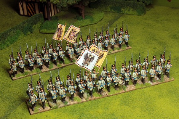
The Duke’s Austrian infantry regiment (1792-1798) will be very familiar to some readers as they have featured in a couple of Eureka Miniatures adverts in the distant past and I have hawked pictures of the first battalion around a few of the miniatures forums over the last couple of years. So a bit ‘old hat’, but they have not had an official introduction on World Crisis in Miniature and this is the first time I have photographed both battalions together – primarily because I only finally got around to finishing the basing on the second battalion a couple of months ago. (It must be 18 months at least since I painted the figures!)
Still not quite finished yet though, as they need someone to command them. The Duke likes his regiments to be led by mounted officers on separate bases, so I will be adding something suitable in the near future. I have decided I like the look of 32 figure battalions (arranged in two ranks) for 28mm figures. Some wargamers play with quite small infantry units (perhaps as little as 12 figures) which I sometimes find a bit visually unsatisfying, while other table top generals are well heeled enough – and have the space – to command much larger battalions of 48 or even 60 figures. I am blessed with a near-permanent gaming table set up, but at seven feet by five it is not the largest and 32 figures seems to be a good balance between the visual aesthetic I want and not having units that are so big I can only get a limited number of them on the table.
What’s next?
So hopefully that has got the Duke back into the swing of things and it will not be another eight months before World Crisis in Miniature returns. And to keep things ticking along I intend to follow this post up with a few more regular, shorter updates on a variety of things I’ll be working on in the coming weeks. The Coburg Dragoons will need expanding and more French infantry are required, but it’s also about time that I properly introduced everyone to the Duke’s other passions – namely his plastic figure based 1/72 – 1/76 (20mm) World War Two project and his 1/3000 Great War dreadnought fleets.
Salutations
DPT
The 29th Regiment finished – and a little on white uniforms and flags
Well, I finally finished painting this unit more than a fortnight ago, but only got around to basing them last week (the distractions of ‘normal’ life in the Plaza-Toro household you understand). Anyway, here they are – the 1st Battalion of the French 29th Régiment de Ligne c.1792-93: all ready to do the Duke’s bidding (command and morale dice scores allowing) on the tabletop of war.
I chose the 29th, from all the other French regiments that I could have selected, because I wanted to paint a unit associated with the Armée du Nord and the great early battles of the French Revolutionary Wars fought in Flanders and Northern France. The French Orders of Battle during these first campaigns are fragmentary and contradictory (a reflection of the chaos that gripped the French army during the early 1790’s), but the 29th are one of the few units that I could establish who probably played a part in most of the major actions. It also has to be said I could not resist painting a regiment that had pink facing colours! As I mentioned in my previous post, the eventual aim is to represent the 29th in its entirety by adding the regiment’s second battalion. Work will begin on this next unit shortly; they will look much the same as these chaps, but the flag the second battalions carried were of a very different pattern from the one unfurled here – and it will be nice to show that difference in my collection. (More on flags later in this post…) I am not sure how many more of these exclusively white uniformed French infantry battalions I shall do because they survived only briefly. From the beginning of 1794 onwards the great reorganisation of the French army (the Amalgame) merges the white uniforms of the old regular army with the blue of the National Guard, and the blue uniforms then steadily gain ascendency.
Painting White Uniforms
A few people around the internet forums have been very kind and expressed an interest in how I paint white uniforms. This is of course a matter of personal taste. You can get a very crisp look to whites employing something like a silver grey or bluish grey base colour, then worked up to bright white on top of that, but I prefer a dusty, somewhat grubby look to my whites – so I start with a murkier set of colours. The picture below is not the best, but it broadly illustrates the process –
My base colour of choice for most whites is Vallejo Paint’s “German Camouflage Beige” (821) in their Model Colour range – a decidedly earthy looking beige-grey. I should probably mention at this point that I usually paint on top of a white undercoat to try and get the best vibrancy out of my colours. After painting the faces (I always do faces first), I carefully block in all my main shade colours, so here – the figure on the left – I have painted in the base beige and the darker shade for the pink facing colours. (Normally I would not have painted much of the black at this stage, but I did here so as to help with the picture contrast). This first stage is in many ways the trickiest because you have to paint accurately – up to all the edges and colour boundaries. The next two highlighting stages are slightly easier because the idea is to leave some of the underlying colours showing around everything so, in effect, the zone you are painting for each highlight shrinks inwards a little away from the boundary edges, and your brush work does not have to be quite so precisely.
For the intermediate ‘mid-shade’ I turn to Vallejo’s Game Colour range and “Bonewhite” (34). The Game Colour paints have a thinner consistency from those of Vallejo’s Model Colour range – a near translucent, sometimes even blotchy covering (I think they are intended for the very subtle multi-layer colour building techniques favoured by the best fantasy miniatures painters), however this quality suits my purpose well. I don’t want to lose the murky base shade entirely so if the coverage is patchy, so much the better. I apply “Bonewhite” fairly liberally to all the appropriate areas, but carefully leaving a little of the darker base shade around all colour boundaries, straps, buttons, pocket flaps and so on – and also in the deeper creases in the ‘cloth’ of the uniform. The middle figure in the above picture shows the result of this.
The final phase simply involves adding white paint to the “Bonewhite” – but never so much that I get too close to pure white. I often do this in two goes: firstly a little white just to increase the opacity of the “Bonewhite” and then I paint in all the same bits I’ve just done with the mid-shade but leaving a hint of the original wishy-washy “Bonewhite” here and there, and then secondly I add more white for a final brighter highlight. This final highlight is reserved for particular parts of the figure I want to deliberately emphasise, such as white belts and straps, the more pronounced folds (ridges) in the uniform, and areas such as outer arms / elbows, the tops of shoulders, knees – anything that ‘sticks out’ really. The figure on the right gives a reasonable impression of the final effect, although if I’m being a bit self critical looking at the picture as I write this I think I was a bit heavy handed with my final highlight on that particular example! But hopefully you get the idea. The next stage is to highlight the pink and then get on with painting the rest of the figure.
I use this method for most of my whites on figures of this size (28mm) – across all historical periods. The whites parts on my blue uniformed French National Guard battalion were done the same way –
Flags…
I like to paint my own flags. Some might think this a little masochistic as there is such a ready supply of very fine looking colour printed flags available commercially, and even for free from various generous souls around the internet. I admit I have my limits. When it comes to needing numerous Austrian Hapsburg double headed eagle flags, for example, I head off to the excellent offerings available from GMB Designs. But I am quite happy to tackle relatively straight forward geometric flag patterns with a paint brush. I was first tempted to have a go at this by Barry Hilton’s article in the ‘Warchest’ section of the League of Augsburg website (second PDF on the list).
The flags are painted on linen which I try to cut as square to the weave of the fabric as I can. For a neat result I think Barry recommends a very sharp knife and a steel ruler for this but I have been known to cheat and use a good quality pair of sharp dressmaker’s scissors (The Duchess hasn’t noticed me borrowing these yet…). Either way, I am not too bothered if I get a little fraying – it all adds character. When sizing the flag you need to allow a couple of extra millimetres for wrapping around the flag pole. For the pole you can try brass rod (soft, and easy to cut and grind) but in the event of an accident it bends too easily for my liking and you can never quite get it absolutely straight again. Like Barry, I use steel ‘piano wire’ (available from most good model shops in various grades) because I prefer its strength – but be warned – it is tough stuff to work with (so remember that when you start cursing me!) The ferrule point is created by flattening the tip of the wire with a hammer on a mini anvil (or the flat side of another hammer acting as an anvil) and then ground into shape using my trusty Dremel hobby tool (For goodness sake – wear safety glasses!) The flag is then glued to the pole using a contact adhesive like Bostick or UHU (don’t use Superglue – it makes the linen fibres brittle).
To paint the flag use exclusively acyclic paint as the process depends on the paint’s ‘plastic’ qualities and the application of heat. Start by undercoating the whole thing with a generous soaking of paint. I go for a base colour relevant to the majority colour on the finished flag – in this case white – so here I have once more opted for Vallejo “German Camouflage Beige”.
Once well and truly dry I set about marking on the basic design lightly in pencil. I sometimes find the drying undercoat pulls and distorts the linen a little (as it did here) so things go out of square. If this happens and things look odd, I slew the design a little to conform with the flag’s newly adopted shape. This can be fiddly but so long as your principal vertical and horizontal lines are parallel to their corresponding flag edges the illusion should be maintained. In this case I leaned the vertical arm of the main cross very slightly in towards the flag pole.
Now we start painting in earnest. A dark blue and a strong red-brown provide the base colours for the blue and red elements and a pale grey/buff-white goes over the beige base – but leaving thin lines of the latter to demarcate the white on white parts of the design. With the main base colours done (above – right) I then start painting on all the detail like motifs, numbers, and lettering. There is no short cut to this part – just a lot of patience and trail and error (and you have to repeat the process on both sides!) I make lots of mistakes, but always have the base colours handy on my palette so I can quickly ‘erase’ any errors and keep going. I usually ‘draw’ these details in a neutral colour like a pale, watery dark grey to begin with and once I’m happy I’ve got everything where I want it I then start to add some colour and contrast.
For lettering (which is often gold, or at least yellow, on many military flags) I first try to paint the word shape in a dark brown. Unless you are dealing with especially large lettering on a flag, I would not worry too much about making it all readable. I try, if I can (and on this particular flag the lettering is so small there was a limit as to how far I could go with the following procedure), to make the first letter legible, and then get the principal upward and downward letter stokes in something like the right place – the rest is then tiny hieroglyphics and squiggles! I then select a nice rich yellow or a bright pale yellow and very sparingly pick out elements of the brown squiggles to give a vague impression of the letters that are supposed to be there. I focus again (if the letter size allows it) on trying to highlight the shape of the first letter of each word (especially capitals), then I pick out some of the long verticals on ‘h’s, ‘b’s and ‘d’s in the same yellow, and things like the crossbars on ‘t’s, and the top curls on ‘f’s. I also dot the insides of ‘o’s, and some of the closed loops in ‘p’s, ‘b’s and ‘d’s. Do not try to do every letter. Sometimes just picking out a few prominent letters in the word shape is enough to trick the eye.
Now at this point I must apologise. I had intended to take a photograph of the still flat flag, with its dark base colours and the basic finer details painted on, prior to folding and highlighting – but I got so carried away I completely forgot to take the shot! I was some way into the folding and highlighting stage before I remembered (sorry!) Anyway, the next step is to fold the flag and for this you need a heat source like a radiator, column heater or even perhaps a hair dryer. The idea is to soften the acrylic paint you have permeated the linen with, but not melt it, so the heat source needs to be indirect. Once softened the flag can be quickly folded and eased into a natural looking wind blown shape. Rolling the heated flag around a paint brush handle can create good rounded folds for example. Then, maintaining the shape while the flag cools, (simply blowing on it can help), should lock in the new shape. I do find this process a little hit or miss depending on the heat source and things like ambient temperature, and sometimes several goes are required to get the desired shape to stay put without the flag slowly flattening out again, but perseverance usually pays off. Incidentally, if you are unhappy with the way the design painting has gone so far you can always scrunch up the flag really tightly to hide some of the failings!
Once the folding is complete it’s back to painting. The aim now is to progressively highlight the ridges of the fabric folds you have just created – while leaving the base shade colours in the bottom of the fabric ‘valleys’. I selected an off-white, a strong red and a mid blue and began blocking out almost all their associated shade colours – working down each raised fabric fold and across the ‘flatter’ areas of the flag, but leaving the shade colours uncovered in the bottom of the deeper fabric folds. The flag on the left above has reached this first highlight stage. As I continue to increase the highlighting (described below) this first highlight colour becomes the darker shade colour for the bottom of any less pronounced folds in the flag’s fabric. Now is a good point to finish the detailing, such as the green leaves of the central wreath which started life in mid-green and are finished with a spot of quite vivid bright green to bring them to life.
I now highlight the ridges again and again, and sometimes again, using a brighter shade with each ‘step up’ and each time painting a slightly smaller area to leave a band of the previous shade showing. The final highlight will be little more than a narrow band running along the crest of each fabric ridge – a bright blue; an orange scarlet; and white respectively. (As flags were prized and cared for I am not looking for quite the same grubby look to the white as I was on the uniforms of the figures, so here I am quite prepared to have a final highlight very close to pure white). The end result is shown above, on the right. There are certainly much better flag painters around than me, but I think it works reasonably well. Finally I give the flag a thin coat of matt varnish to protect it and to help stiffen the fabric a little more. It is then glued into the hands of its bearer and I paint the flag staff last of all. You can add further decoration like streamers and tassels to the top of the flag pole, but I have not had the courage to attempt that yet.
I hope that all made some sense, in spite of my disjointed photographic record of the process!
Until next time – Salutations!
Plaza-Toro
Work in progress – and a review (sort of) of some 28mm buildings
Well, it is about time I demonstrated that my first posts were not just a flash in the pan and that I follow them up with another ramble description of current goings-on at Castle Plaza-Toro. This blog is supposed to keep me ‘going-on’ and focused on finishing my projects, so blog momentum needs to be maintained! I must pause at this point and thank everyone for their kind comments regarding my first steps into the blogosphere, both those attached here and the encouraging words spoken on wargames forums like WD3 and The League of Augsburg. Many thanks to you all.
Right then. After kick-starting everything a little over a week ago with pictures of my French National Guard battalion for the beginning of the Wars of the French Revolution, I thought I would let everyone have a peak at some work in progress on my next French unit. I am always a little cautious about showing unfinished work – in the raw, as it were – but I know many of you like to see the creative process in action so in the coming weeks (I’m a slow painter) the plan is to follow this unit at various stages towards its completion. So here it is – with just over half the figures done but nothing properly based yet.
This is going to be a battalion of the 29th Régiment de Ligne, the old Dauphin regiment of the pre-Revolution French army, representing its appearance during the early campaigns c.1792-93. For those unfamiliar with the period who are wondering what the difference is between this and the contemporary French National Guard unit that featured in my first post, it is perhaps best to think of the French infantry at this time as being divided into two distinct parts – one white, one blue. The white uniformed regulars (such as these) represented the last vestiges of the old military order, while the blue uniformed volunteers and conscripts of the National Guard were born out of the recent Revolution. The political radicals in Paris mistrusted the regular army because of its ties to the Ancien Régime and so the National Guard was raised (and expanded) as a more ‘politically sound’ bulwark to protect the fledgling Republic. In reality it was often les bleus of the National Guard that proved less than reliable, and in the Republic’s early moments of crisis it was sometimes les blancs of the old regular army who provided the desperately needed experience and backbone to see the French army through. Before long the two halves of the army were destined to be merged into one, in a drawn out process from late 1793 to the end of 1794, but that is a discussion for another time.
As a battalion of the old regular army I want this unit to have a more professional military air about it, compared to the deliberate ‘disorganised chaos’ look of my first National Guard unit, so I have chosen figures from the Eureka Miniatures range all in the shouldered arms (march-attack) pose and everyone will be based in fairly neat rows. However, conformity only goes so far, and I have once again mixed Eureka’s choice of smart, regulation appearance figures with those wearing ragged and tatty campaign uniforms. While some regiments of the regular army managed to retain a level of professionalism many other regiments declined rapidly as experienced officers fled France and the rank and file deserted in droves to re-enlist with National Guard units where the pay and conditions were better! Crippling shortages meant no replacement uniforms or even shoes and what little was supplied was invariably of inferior quality. Within just a short time of campaigning even the better quality regiments took on a dishevelled, decidedly un-military bearing. Here then, we have some figures with plums, others without; some wear the full fur crested helmet (introduced in 1791 and hugely unpopular) while others only get the economy version with a stuffed fabric sausage instead of a crest. Some non-regulation coloured shirts and trousers have started to creep in. And yes – the 29th had pink uniform facings! I intend to do both battalions of this regiment (two different flag designs) at some point. More as we go…
28mm Buildings from 4Ground.
The Duke is always on the look out for new real estate, and some of the (relatively) new laser cut building kits from UK company 4Ground have caught his eye. I first encountered these type of building kits when a friend showed me the hugely impressive laser cut model of Rorke’s Drift available from Warlord Games (made for them by 4Ground). Computer controlled laser cutting has reached a point where not only can small part kits be cut from thin MDF board with great accuracy, but the laser can even etch surface detail onto the various pieces. This produces an easily assembled model that (depending on the version you buy) comes complete with a game ready finish that can require little or even no further attention before you plonk it straight onto your battlefield. Indeed a quick visit to the 4Ground website reveals that they are now offering their kits as a fully painted option. They also offer what they call “Silhouette” versions of some buildings, which only have the very basic detail cut into them and are aimed at modellers who want to adapt them.
For the Duke, I got two versions of the same building – 4Ground’s “Old Timber Frame Cottage” – one in its unpainted but full surface detailed form, and the other the Silhouette ‘plain Jane’ variant. I got both for no particular reason other than I was interested in how they differed and how much I could muck around with them. What follows then is a sort of part review, and part me adapting them type of story. Here is my finished take on the surface detailed version –
I built this pretty much straight out of the packaging. You can buy additional finishing kits from 4Ground called things like “Tudor” or “Stuart” with period appropriate doors, window architecture etc, which I didn’t bother with, but even so the only things I have added here are a door, some pseudo lead light windows, and a little paint. The first thing I can say about these laser cut buildings is they go together ridiculously easily. The model comes to you as a bag of flat-packed MDF wooden boards. The cut parts pop out of the boards with a little gentle persuasion (I used a sharp knife to tidy one or two scares left by the tabs) and everything then clips together with a satisfying precision. A little PVA wood glue is certainly recommended for build strength, but many of the parts fit together so accurately and snugly you could conceivably use almost no glue at all. Even with the gluing time, it took me less than half an hour to complete this model, and only once did I resort to a few strokes of a file to make the roof panels fit a little better. I then added a door of my own making (balsa wood) and to get a lead-light effect I glued some pieces of fly screen behind each window. The latter is a bit of a botch-job, as the fly screen ‘squares’ are not actually, well… square – so when you rotate it through 45 degrees you don’t get a nice symmetrical diamond effect. However, this is one of those occasions when I say “It’s just a wargames model” and the overall impression is perfectly adequate.

The building breaks down into three sections (left). I added corner blocks to the underside of the first storey to ‘key’ it into the ground floor section (right)
The finished building breaks down into three sections to facilitate access to the interior (ideal for RPG and skirmish gamers – or for people like the Duke who prefers to place his troops inside the building they are defending). This revealed perhaps the model’s principal negative – there is nothing to hold the three sections together. I soon discovered that a lack of concentration when picking the whole thing up often resulted in one or both of the upper sections sliding off and bouncing across the tabletop (or the floor!). This was remedied with a couple of off-cuts from the left over MDF boards glued underneath two opposite corners of the middle section (see the above, right hand picture) to ‘lock’ it (loosely) into the corresponding corners of the lower section. I then glued a short tab of balsa wood inside (and just protruding below) the bottom edge of each gable end wall of the top section (sorry, not quite visible in the photograph) which just tuck in behind the walls of the middle section to hold that in place as well.
Painting was straight forward. I was very impressed by the fine timber grain effect the laser etches (burns?) into the model’s timber framing. I just painted this a dark brown and then dry-brushed in a paler grey-brown shade to bring out the grain. The plaster panels were then painted a dirty cream/buff, and a bluish-grey slate roof completed things. From a visual perspective the roof is perhaps the most disappointing aspect of the model, being flat and two dimensional – more like a pavement than overlapping roof tiles. I attempted to add some optical relief to the surface by highlighting each tile (most of the pictures show my first rough attempts at this – the picture of the two finished buildings at the end of this post show it after a second much more stylised re-paint).
And so to the “Silhouette ” version of this building –
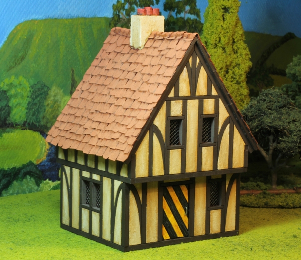
As you can see the plainer (and cheaper) Silhouette version of the model is identical to its twin but for the lack of the extra surface detail: no wood grain effect, no interior stuff. I decided to do with this what 4Ground intended – apply some touches of my own. At this point I had just added my (slightly unsatisfactory) lead light windows, and I was considering painting the wood grain effect onto the timber frames by hand. Some painters are really good at this sort of thing – I’m not, and I wasn’t happy with my test runs. So admitting defeated, I adopted the Duke’s usually policy in these situations, which is – “If you can’t make one bit of a model look as good as you’d like, damn well make sure you distract the viewer’s eye by making some other bit look more interesting.” Accordingly I concentrated on the panels between the timber frames. I blocked all these in with textured paint. Textured paint is one of the great friends of the model maker. I have three grades of it: the coarse variety which I use for ground work on almost everything; a finer sandy mix for things like track ways and texturing the walls of adobe buildings etc; and a sort of thick silty consistency paint that the hardware stores often call “Suede” finish. You can pick all these up in relatively inexpensive sample pots from your local paint or hardware store – check out the customer return/dump bins even. Colour does not really matter as you are usually going to paint over it, but given a choice any earthy shade will do. For the panels on this model I used the Suede finish, applying it fairly thickly, but keeping it off the timber frames. Once dry I then painted this more tactile surface in a base of ochre and worked it up with increasing amounts of white to the finish in the picture below. (because of the plainer detailing I wanted this building to be ‘brighter’ than the first). The timber frame? Well I just painted all that a very dark brown (to suck in the light) and left it at that – no highlighting – nothing.
The other, immediately obvious feature I added, is the improved tile roof. I decided on this at an early stage and to accommodate it I permanently glued the top and middle sections of the model together (more on the implications of this later). The roofing technique will be familiar to anyone who has read one of Games Workshops’ books on model making and is just lots of individually cut squares of “cereal box” cardboard, glued on in overlapping rows. Yes – it is fiddly and labour intensive (it took me a whole evening to tile all the roof), but all the cutting can be done with scissors and once you get into a rhythm it goes quite quickly. The lines of the model’s original ’tiles’ on the MDF roof beneath act as a convenient guide to align your tile rows by, but accuracy isn’t paramount. The effect is best achieved by cutting your tiles to slightly irregular sizes and gluing them on in a slightly haphazard fashion. ‘Distressing’ some of the tiles by clipping off corners all adds to the rustic charm. The ridge tiles were cut from a single ‘wave’ of corrugated cardboard and the whole lot was given a coat of textured paint. I also added my own chimney as another feature to set this building apart from the first one – just a couple of pieces of cork floor tile, cut to fit the angle of the roof and glued together in a sandwich – then more textured paint. The chimney pots are roughly cut plastic drinking straw (and, yes, even more textured paint!) The door is another of my design, but again a different appearance to differentiate it from the previous building.
For completeness, I should also mention the internal alterations I made to this model – if nothing else because it illustrates just how obsessive we wargamers can get about our little preferences! Allow me to explain… With the previous building I had already discovered that it was difficult putting figures inside it on the ground floor, if they had upright muskets or similar protuberances – because the ceiling is too low! Now, this did not matter as they did fit under the higher angled roof of the first floor. (Stay with me here – don’t nod off now…) However, my decision to permanently glue the two upper sections of this version of the building together (because of gluing on the tile roof) essentially sealed off access to the first floor (Shock! Horror!) So I carefully cut out a square in the base of the combined upper section (with hole and jig saw) so the ground floor can now accommodate figures – bayonets and all (as above). Of course, none of this will be of the slightest interest to you if you are the sort of wargamer who could not care less about sticking figures inside buildings – but I’m afraid the Duke just loves this sort of thing.
Anyway – here is the finished building –
I went for a terracotta tile roof colour – yet again just to set this building apart from its twin – although in truth, big square tiles like this should probably be slate. Small details like the door handle’s different design and location are also done for variety. You can judge for yourselve if this all works by taking a look at the two models side by side –
As mentioned earlier, I had another go at faking some 3D effect on to the flat blue slate roof as shown here, using a much more stylised painting technique. It is a bit bold and I am not sure it works (although I should add the lights I took the photograph under make it look bluer than it actually is).
Well, that’s it! I am really impressed with these models. They are not expensive (certainly not the Silhouette versions), assemble really easily, hold their own very well straight ‘out of the box’, and with a little extra effort can be turn into very respectable models. I just scratched the surface really, and better modellers than me could really go to town on these. A downside? None to mention apart from the finished sections falling off each other all the time (which can be fixed easily enough) and perhaps the rather bland appearance of the tiled roof as supplied – but for the purpose these models are intended (and the price) it’s good enough. I would offer only one minor note of caution to those potential buyers who have smaller gaming tables who do not want many large buildings dominating too much of their gaming space. Although the footprint of these models is not especially large (90mm X 80mm) they do stand quite tall (130mm to the top of the gable end), and if many of your existing model buildings are deliberately under-scaled (as many ‘big battle’ gamers tend to favour) these will stand out in the crowd somewhat. Mind you, if you are looking to quickly turn your whole gaming table into an urban landscape you should probably consider buying these in bulk. Highly recommended. Check out the 4Ground website http://www.4ground.co.uk/ for the full range (including now 15mm / 1:100 scale buildings). Local Australian customers can order some of the range from Eureka Miniatures and War & Peace Games (see my links).
Salutations
Plaza-Toro
British and German Battlecruisers
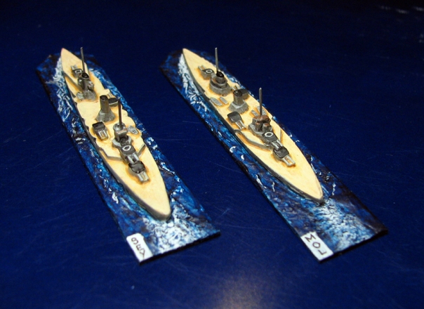
The Duke’s naval aspirations are very much a side project and posts in this section might be infrequent. In the meantime, so that visitors are not confronted by a blank page, here are some Great War Battlecruisers, by way of a ‘taster’.
All models by Navwar (1:3000 scale) with a representation of masts added in wire, and based on thin plastic with ‘ocean’ effect added.
Salutations
Plaza-Toro
Please allow me to introduce myself…
I wonder how many blogs have started with the first line from Sympathy for the Devil for their introductory post? Thousands no doubt. Not that the lack of originality will bother the Duke of Plaza-Toro, whose enemies around the royal courts of Europe like to whisper that he is more than a little sympathetic to the creed of Beelzebub. He tells me he rather enjoys the notoriety.
So – Greetings and welcome! World Crisis in Miniature is the personal blog of His Grace the Duke of Plaza-Toro where he will duly describe his miniature military adventures with toy soldiers, ships and tanks to the interested reader and fellow devotees of the harmless, but alarmingly named, hobby of war-gaming. The Duke likes the sound of his own voice and will no doubt have plenty to say, but occasionally his humble servant, John Chadderton, might get a few words in edgeways.
Lets start with a picture (worth a thousand words they say…)
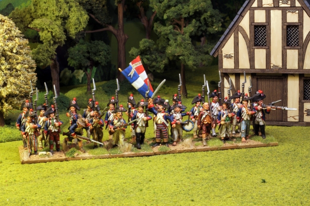
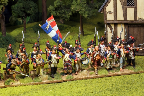
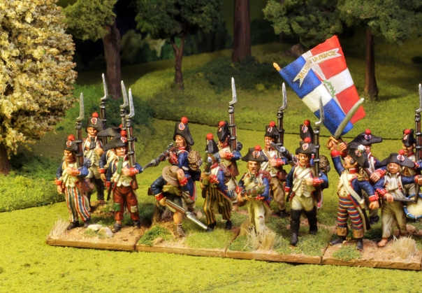
Here then is my first French National Guard battalion (c.1792-93) for the Wars of the French Revolution. All 28mm size figures from Eureka Miniatures (with a couple ‘drafted’ in from their American Revolution range), all painted by yours truly. They serve as a good introduction to one of my principal interests (the wars of the 18th and early 19th Centuries) and provide some idea as to my modus operandi.
At this early stage of the French Revolutionary Wars the quality of these rapidly recruited National Guard battalions was variable to say the least. Many units were hot beds of political radicalism, on occasion more than capable of shooting their own officers if it suited them. Their training was rudimentary, standards of equipment and uniform were indifferent, and their courage on the battlefield very brittle. Some battalions fought well, but many ran away at the first sign of trouble. Here I have attempted to convey all this. The figures have been selected and based in a suitably disorganised manner with some chaps marching, some breaking into a run, others dangerously firing from the rear rank and so on, while the officer (front and centre) vainly tries to keep control of it all.
The Eureka Miniatures range lets you pick and choose your figures to mix relatively smart French soldiers in regulation uniforms including gaiters, shoes etc with figures of a much more ragged appearance in tatty, incomplete uniforms – minus gaiters, shoes, and breeches (hence the period nickname “sans culottes”). Non-regulation trousers (often in fashionable stripes), coloured shirts, civilian hats and other personal items were common. So large was the number of French citizens conscripted into the National Guard to defend the new Republic that the army’s resources were stretched beyond breaking point and many citizens went into action in the civilian clothes they had arrived at camp in. To hint at this I added a figure to the front rank (the gentleman in brown) from Eureka’s “Age of Reason” American Revolution range of “Ragged Continentals” who is in suitably generic 18th Century civilian dress and not as discernibly ‘North American’ in appearance as some of the other figures they offer. He makes a good French citizen recruit and he has at least been issued with a musket – even these were in short supply.
The other figure I added from Eureka’s American Revolution range is the chap ducking forward (third in from the left) trying to avoid getting his head blown off by the overenthusiastic ‘marksman’ in the rear rank. He comes from the “Ragged Continental Infantry skirmishing” group of figure variants and I think he is just supposed to be running low and holding on to his hat, but when I first saw the figure he gave me the impression that he was ducking as if to avoid something. When I was planning the look of this battalion I suddenly recalled this figure and thought he would be an ideal addition to the unit’s chaotic demeanour. His civilian hat is perfectly in keeping, but his soldier’s coat isn’t quite right for a French soldier of 1792 (the model’s cuffs have no flaps). However once I’d painted him up in the familiar blue, white and red he passes muster. As it is, during this early period the army absorbed a plethora of independent volunteer units from across regional France, all wearing locally made uniforms that often did not confirm to official regulations, so the flap-less coat cuffs are probably not that anachronistic anyway.
Those familiar with the period may have noted the absence of any grenadiers (the supposedly elite company that formed part of the organisation of all these battalions). Usually distinguishable by their bearskin caps or bicorne hats adorned with tall plumes, I may decide to add them to this unit later (another base of four figures), but seeing as the common practice of the time was to detach all the grenadier companies from their parent units and combine them into special Grenadier Battalions in their own right I might as well just paint up a separate battalion of grenadiers at some point.
Well, I think that might do for the Duke’s first post. At a later date we will have a look at some of my Austrian battalions – arguably Republican France’s most constant opponent between 1792 and 1815 (after all, the French did guillotine their cake loving Princess…) and some of my current ‘work in progress’ projects. The Duke also likes to manoeuvre 1:72 / 1:76 scale tanks and command his 1:3000 scale battleships when the mood takes him and I have optimistically added tabs to the blog for them in readiness (but sorry – nothing to read there as yet). I suspect the Duke will have a few things to say about painting, model making and wargaming in general as we go. I am a total novice when it comes to blogging and I am just feeling my way around the technical aspects so please forgive any initial blunders. I will no doubt be adding features and sometimes removing them as I try things out. Comments are always welcome. I hope this first post was at least of some interest and that you will call again. The Duke keeps a very good wine cellar.
Salutations
Plaza-Toro
